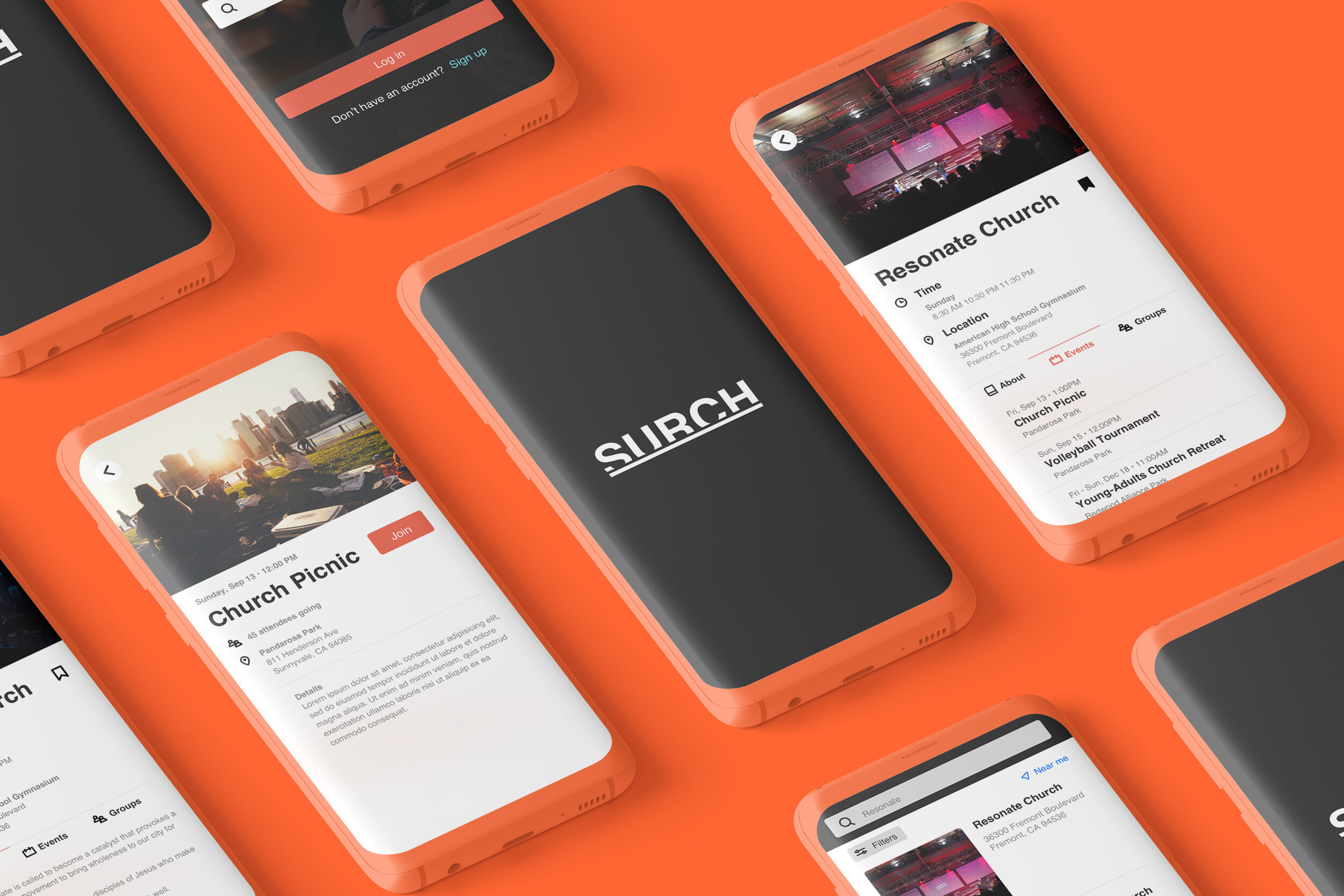
Surch — A Church Searching App
Role: Researcher, wireframing, interface design, prototyping, copywriting
Project Type: iOS Mobile App
Duration: 8 Weeks
This was work done during my 10-week long UX Design Immersive Bootcamp from General Assembly
Overview
Prompt
I was tasked to design a solution for a problem I was passionate about. I took steps to identify a problem that a specific group is experiencing and solve it in the way that is best for that target audience.
Context
Ever since I was a child, I would attend church with my family regularly. When it came time for me to decide what church to commit to, I found myself struggling deciding which church I identified most with. To me, one of the most important things about a church was whether they had a connected community. This sparked the idea to create a hypothetical app named Surch, to solve the problems a church goer would experience.
Hypothesis
I began this project first by brainstorming problems the church community might have before research by posing “How might we” statements. The goal is to think of what the user is possibly thinking or feeling and what is most important to the user the most.
How might we make the process of church finding easier for someone who is searching?
How might we increase interactions with church goers?
How might we get more people involved and committed at church?
After brainstorming, I came up with a hypothesis to the user problems:
The problem I suspect is there are not enough opportunities to meet new people at church in order to feel more tightly connected as a community.
User Interviews
It was time to put my hypothesis to the test by conducting user interviews over the phone. This step is crucial to truly place myself in their shoes, empathize, and realize actual user feelings, what they are seeing, hearing, doing, and their current environment.
Research Goals: Discover whether church goers have enough opportunities to meet people at church.
Target Audience: Young to middle aged adults, Ages 18-35, who are interesting in either searching or attending a church.
Some questions asked:
How has your experience been with the church community?
Do you attend a majority of events at your church?
Do you attend church regularly?
Affinity Mapping User Interviews
From the information gathered from 5 different interviewees, I grouped each person’s experiences into common themes using post it notes.

Distill Findings
To my surprise, the majority of pain points in the church experience was a lack of knowledge regarding events, and not a lack of opportunities like I had hypothesized.
A majority of interviewees expressed:
“I don’t know about events.”
“I didn’t know where the event was located or what time it was.”
“I don’t know if there’s a young adults group.”
“It was difficult to navigate through the church website to find what I needed.”
“My church events are not regularly announced or posted.”
Problem Defined
After user interviews and affinity mapping, the assumption that church goers needed more opportunities to connect outside of church was disproved. The true problem was not that the church lacked enough events, but lacked event publicity.
Without easy access to church events, interviewees identified lack of motivation in seeking out the information themselves.
Those who were searching for a church to commit to felt unmotivated to view many church websites, all with different user experiences.
Those who expressed interest in church events were complacent in their goal when they lacked direction, not knowing where to find the right information quickly.
This gave me the idea of creating a unified platform where information regarding a church was predictable and easily accessible.
Therefore, the project goal is to create a unified platform that makes access to church information quick and easy.
Project Goal
Give church goers a unified platform to search for churches quickly and easily.
Give church goers easy access to information most important to them.
Remove the burden of diligent web searching for the user.
Proposed Solution
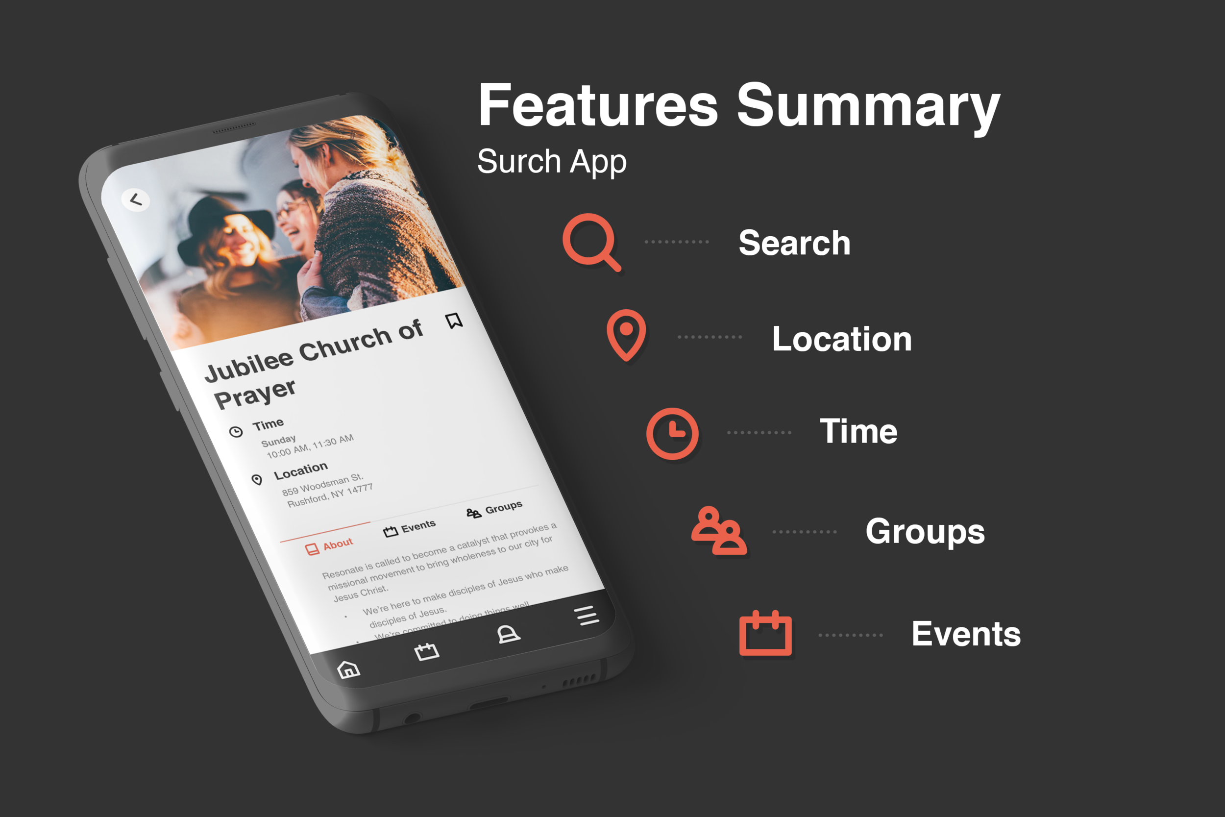
To create a mobile application that feeds church information regarding service time, location, dates, and events quick and easy.
To standardize a church information system and help solve communication problems, general forgetfulness, and to simply inform the uninformed.
Defining the User
Personas

Philip, 25
Single
Chicago, Illinois
Data Analyst
"Never die alone.”
Philip regularly attends church and works a 9-5 job. Philip is very social and makes every effort to connect with his friends at least once a week.
Frustrations
Philip is unaware of church events, location, and times.
Goals
Philip desires to find a way to know about events sooner and make availability in his schedule to attend. He wants to build stronger connections with his church community.

Kimmy, 28
Married
Fremont, California
Software Engineer
“Family is everything.”
Kimmy attends church every other week and is working mother, juggling a competitive job along alongside responsibilities of her two kids.
Frustrations
Kimmy is so busy with work and kids that she does not have time to ask her church friends or research about upcoming events of the church.
Goals
Kimmy wants to find support from other families to connect with, but needs to find opportunities and plan ahead quickly.

Jason, 22
Single
Syracuse, New York
Recent Graduate
"Be the best person you can be.”
Jason is fresh out of college, moved back to his family’s home, but is very interested about Christianity and wants to find a church with people he can connect with to learn more about this religion.
Frustrations
Jason wants to find out about different church’s young adults groups, but cannot find that information easily.
Goals
Jason wants to learn more about Christianity and find a community that is around his age at who share similar life stages.
Storyboard
After defining my users, I feel comfortable to create a storyboard that follows Jason, one of the personas made. The story empathizes Jason’s user experience, thoughts, and emotioins while searching for a young adults church group.
Competitive Analysis
A competitive analysis gave clarity to the current market by identifying what problems companies were already trying to solve. By being objective, I discovered most competitors had a clean UI and easy search navigation. Areas of improvement I identified within the competitors was a stronger layout of information, especially for organizations that had more than one event. Many competitors relied on additional websites to fill in the holes of missing information. These areas of improvement for my competitors presented opportunities for the Surch App to excel over the competition.


Feature Prioritization
It was important to take a step back, recallibrate, and focus on what features were worth fully dedicating my time with. It helped to acknowledge features that were definitely nice to haves, but not absolutely crucial or directly solved user problems. Noting what were essentials to the app and the amount of expenditure of resources gave clear guidelines on what to tackle from start to finish.

User Surveys
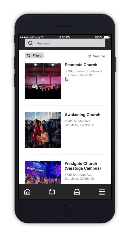
Quantitative research was conducted with a total of 16 participants via Google Forms in order to understand what categories were most important to users when searching for churches. Each user was only allowed to choose their top 3 categories they would use when searching for a church. Based on the survey responses, the Surch App would take the most popular categories to be included in filtering searches within the app.
Top category Results:
Near me – 92.9%
Multi-ethnic –50%
Population size –21.4%
Age range –21.4%
Complimentary food –21.4%


Minimal Viable Product (MVP)
Our minimal viable product is creating a feature that allows a user to easily search and find a church, and be provided with most important information about them.
Features I wish to include in the mobile application are an overall user-friendly and organized structure of church information to help church goers stay in the loop about the whereabouts of the church. The ability to search for the church of interest, viewing service time, location, groups, and events.
The base design is quite easy to implement, but most constraints I foresee will lie in all the additional “nice to have” features like a chat system, event sign ups, adding recorded sermons, and having a location gps for users to search by the area closest to their home.
Design
Sketch Wireframes


User Flows

Philip’s User Journey
Peter’s desire to be updated on upcoming church events is solved through his Surch App user experience.


Kimmy’s User Journey
Kimmy’s desire to find a potential family support group is solved through her Surch App user experience.


Jason’s User Journey
Jason’s desire to learn more about Christianity, easily search for local churches, and find a common aged community is solved through his Surch App user experience.

Usability Testing
3 usability tests were conducted. The testers navigated through a fully designed prototype of the Surch App.

Common Feedback:
Very intuitive and user-friendly.
Key information was quickly identifiable without needing to scroll down.
Improvements/Suggestions:
Add search categories and more search options.
The light shade of grey on event titles gave the impression that they were unavailable and had expired.
Expected ability for swipe gesture to navigate through different pages on mobile.
Olivia, during user testing explained, “people don't do a ton of web research and just want to attend a church and get the vibe of the place based on instinct. Therefore having information like time front and center makes a lot of sense.”
Takeaways
I am not the user: It was very easy for me to assume I knew the user’s needs before researching actual users. My hypothesis to what I thought were user problems, were not actually a painpoint experienced by any of them. If I neglected diligent researching of actual users, I risk creating a solution to a problem no one shared.
Always ask why: It was important to continue asking myself why I was designing an experience a certain way. If it did not align with the user’s painpoints, I needed to rethink my motives.
Remember the problem and clearly define it: There were times I realized I was creating additional features that were nice to have, but not essential. Remembering the goal of the app and defining the minimal viable product helped place my efforts in the right places.