
Smart Re-entry into Adobe Express
System-Level Repeat engagement Workflow
Role: Lead Product Designer (sole designer on cross-functional team)
Constraints: 2 weeks from concept to finalized A/B designs
Geo: Worldwide
Surfaces: Mobile & Desktop
PM: Michael Guthmann
Engineering: Sanjeev Singh
Analytics: Shankar Sinha
Research: Isabella Fröhlich
Problem framing
User Problem
Nearly half of our users (48%) require multiple days to complete projects, but struggle to resume their progress due to a cluttered, overwhelming homepage. Research confirms that the current interface creates significant friction, making it difficult for users to quickly locate "in-progress" work and leading to project abandonment.
Out-of-Scope (Constraints)
While the homepage experience is a primary pain point, a full homepage redesign was out-of-scope as parallel teams were already addressing its complexity. Consequently, we had to architect a high-impact solution that functions independently of the landing page, ensuring a seamless "resume" workflow regardless of existing homepage hurdles.
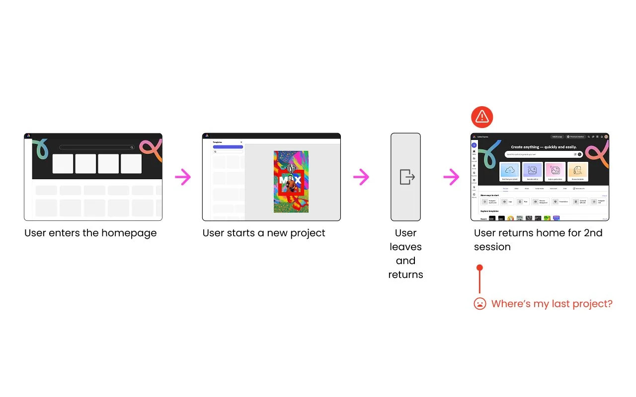
Current user journey with it’s pain points
Designing the solution
Hypothesis
We believe that automatically surfacing a user's most recent work will reduce re-entry friction, increase project completion, and ultimately drive exports.
Success Metrics
Primary: Increase in project downloads/exports
Secondary: Increase in return monthly active user
Design explorations
I analyzed the existing user journey to test a control group against two distinct variants, hypothesizing that automatically surfacing recent work via coachmarks or toasts would reduce re-entry friction and drive project completion and exports.
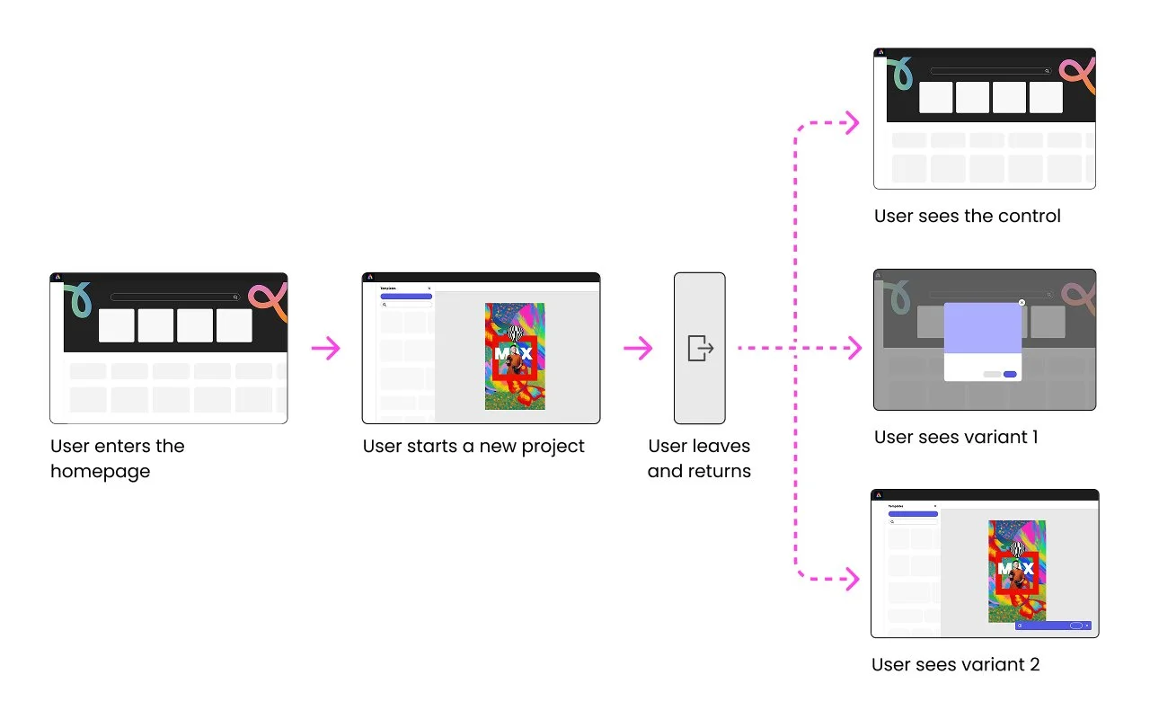
New user journey with 2 variants for A/B testing
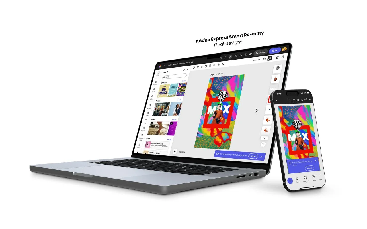
Variant 1 surfaced a coachmark on the homepage while Variant 2 skipped the homepage entirely taking users to their last project.
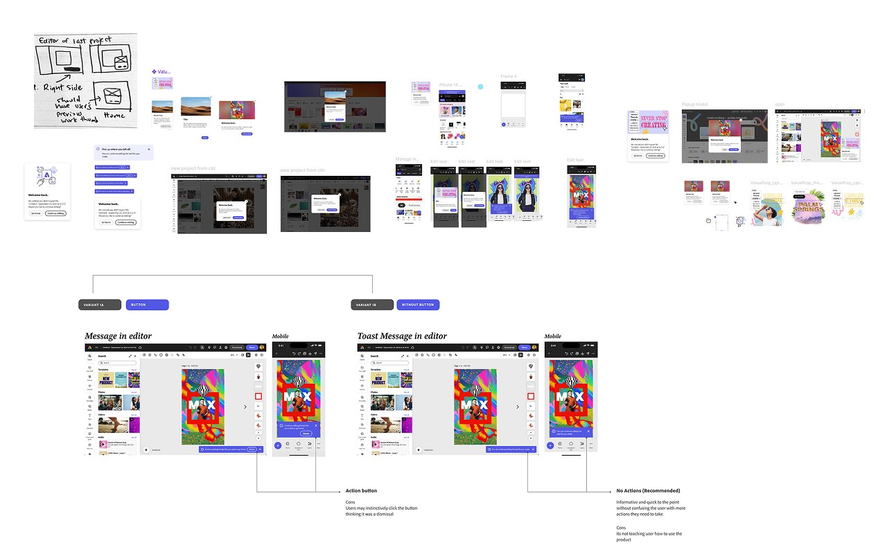
Wireframes
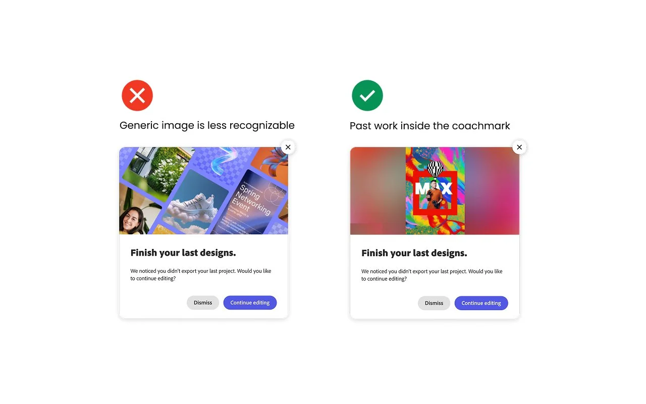
I explored the Adobe design system to determine the best delivery for user messaging, ultimately selecting a high-visibility coachmark with a dark overlay for the initial launch and a non-intrusive toast to allow uninterrupted work and auto dismissal.
Coachmark preview logic
By identifying existing thumbnail logic with the engineer, I bypassed two weeks of development to ensure we could surface actual project previews instead of generic images, maintaining our test timeline while staying true to the core hypothesis.
Building trust in the details
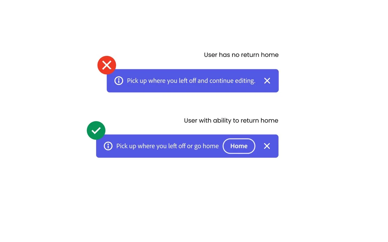
To prioritize user trust and transparency, we included a "Home" CTA in the Variant 2 toast, accepting the risk of lower immediate export rates in favor of providing users with clear control and long-term retention.
Cross-team alignment
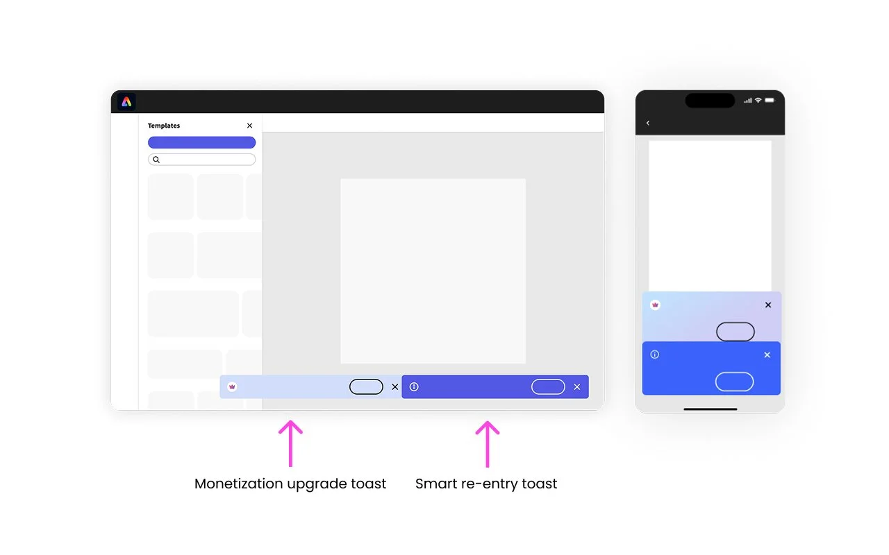
By identifying a conflict between my project's toast and a monetization prompt during pre-launch testing, I successfully coordinated with cross-functional PMs to suppress the competing notification, ensuring a clean data read for our A/B test.
Results & findings
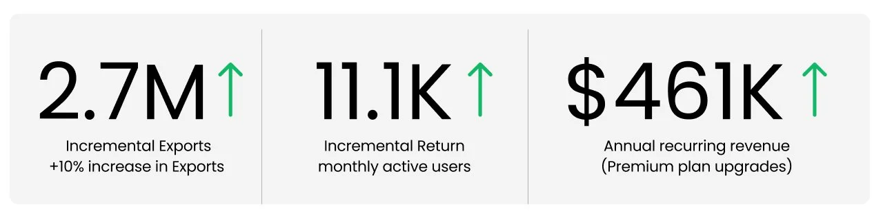
Variant 2 that skipped the homepage and took users directly to their last project emerged as the top performer, driving a substantial lift in project downloads and a 10% overall increase in exports.
Takeaways
Cross-Team Strategy
By identifying overlapping UX conflicts through rigorous pre-launch testing, I successfully coordinated with the monetization team to prioritize our experiment, ensuring a clean data read while maintaining a cohesive user experience.
Strategic Rollout
To balance the 10% lift in exports against a decline in mobile trial signups, we executed a desktop-first global launch while re-evaluating the placement of mobile paywalls for future iterations.
Reduced Cognitive Load
Our results prove that routing users directly to their most recent work eliminates decision fatigue, serving as a powerful driver for return engagement and long-term project completion.
Personalized Evolution
Following this successful test, we are evolving the "smart re-entry" solution into a broader personalization workflow that empowers users to choose between a standard homepage or their past work as their default starting point.